
Designing a Premium Banking Subscription for Gen-Z
Step Black
About Step
Step is a digital bank designed to help improve the financial future of the next generation. The Step Card’s unique structure allows teenagers to start building credit safely, and within a few years we had built a large and engaged user base.
By 2023, we had built a strong product, but the business needed to evolve.
We needed to:
Retain users as they aged into adulthood
Increase account funding through ACH and direct deposit
Introduce sustainable revenue streams
Our long-term strategy has always been to acquire customers early, when acquisition costs are low, and provide a great product so they continue to bank with us as their financial lives (and value) grow. To do that, we needed to evolve from being a “starter bank” for teenagers into a primary financial account for young adults—a place they trust enough to deposit their paycheck.
That shift introduced a new challenge.
The Challenge
One promising solution was a premium subscription offering. However, we knew that introducing a paid subscription could raise suspicion among our audience. Gen-Z users are highly skeptical of financial institutions. Charging for features that previously felt free could easily damage the trust we had built. The challenge became:
How do we introduce a premium banking subscription that users feel is genuinely valuable rather than exploitative?
Understanding the User
This was our first major product initiative targeting users over 18, so research played a central role in shaping the product. We gathered several inputs to understand what this audience actually valued.
Feature Requests from Existing Users
Users could submit and upvote feature requests through our customer support portal. Some of the most requested features included:
Interest on savings
Cashback and rewards
Metal or other premium card designs
These early signals helped identify areas of interest but didn’t explain how much users valued each feature or what tradeoffs they would accept.
To answer that, we ran a conjoint analysis with a large sample of customers.
Conjoint Analysis
This allowed us to evaluate how users prioritized different product attributes such as:
Subscription price
Cashback rewards
Savings APY
A metal card
The results were revealing.
Results
We initially assumed that status features like a metal card would be the centerpiece of a premium offering. However, the research showed something different.
Key takeaways included:
Price sensitivity was extremely high among our audience
Users strongly valued cashback rewards, particularly related to food and dining
Users liked the idea of savings APY, but many didn’t understand the term “APY”
The biggest insight was this:
Gen-Z users weren’t looking for a “premium” experience in the traditional sense. They wanted a product that helped them make more money and manage their finances better.

Aligning the Organization
As we learned more about what users were interested in, the next challenge was aligning multiple teams on how the subscription should work and how it should appear in the app.
This feature required coordination across:
Three internal product teams
Marketing
Executive leadership
Because the subscription would touch many areas of the app, we also wanted it to have a distinct visual identity that communicated its value.
At the same time, the timeline was constrained by seasonality. Many young users start their first jobs in the summer, which meant we needed to launch before the end of the school year to capture direct deposits from summer paychecks.

Collaborating on Product Strategy
To accelerate alignment, I facilitated an in-person working session with stakeholders across product, engineering, and marketing.
During this session we:
Aligned on the business objectives for the subscription
Mapped the core product flows
Defined the initial feature scope
Established launch milestones tied to the summer timeline
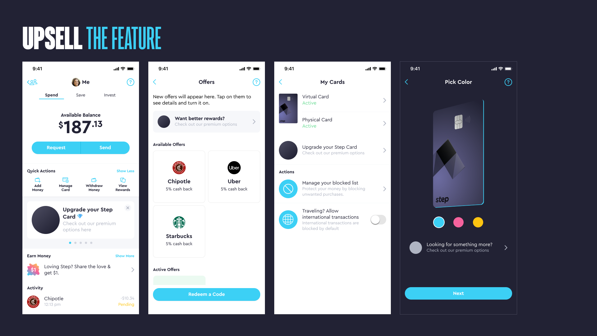
We used simple wireframes to communicate the product concept and drive discussion. This allowed the team to quickly move from abstract ideas to concrete product decisions.
Maintaining Alignment
Once we aligned on scope, we began documenting the design work and distributing responsibilities across the design team.
Because the project spanned many areas of the product, clear documentation and file organization became critical. We established weekly design reviews to maintain alignment and ensure steady progress across teams.

Iterating with Real Users
We launched the first version of the subscription as a soft launch in May 2023. From the beginning, we expected the product to evolve based on real user behavior.
The initial offering included two tiers; Step+, Step Black.
Once the product reached real users, we began to see clear patterns in how people interacted with it. Data and user feedback revealed several important insights.
Users preferred clarity over status.
Due to price sensitivity, monthly billing significantly reduced friction.
The metal card generated excitement but wasn’t valuable enough to justify including it in the subscription cost.
Based on these insights, we made several major adjustments to the product.
We combined the two tiers into a single offering.
We made Step Black free for users with direct deposit, reinforcing the behavior we wanted to encourage.
And we separated the metal card into a one-time purchase instead of bundling it into the subscription.
These changes simplified the product while keeping the subscription aligned with user value and ensuring it didn’t feel exploitative.

Final Product
The final version of the subscription included:
$4.99 per month or free with direct deposit
5.00% APY on savings
Up to 8% cashback rewards
An optional metal card available for $49.99
Instead of positioning the product around exclusivity or status, the offering focused on helping users financially. Users could earn more money through cashback, which many viewed as a discount on purchases. We also encouraged savings growth through competitive APY.
Impact
The subscription helped reshape how users interacted with Step.
Within months of launch:
We introduced two new revenue streams
Direct deposit adoption more than doubled
ACH funding increased 300% over the first year
Beyond the immediate metrics, the product helped shift Step’s positioning from a bank designed primarily for teens to a platform capable of serving users as they moved into adulthood.
Importantly, the product also remained aligned with our mission and with what our users valued.
What I Learned
Premium Products Must Deliver Real Value
Our research showed that Gen-Z users were skeptical of products that felt cosmetic or status-driven.
By focusing on cashback and savings rewards instead of luxury features, the subscription aligned with users’ real financial priorities.
Launching Early Accelerates Learning
Internal debates or user research alone couldn’t fully answer questions about pricing, tiers, or perceived value.
Soft launching the product allowed us to observe real user behavior and evolve the product into a simpler and more effective offering.
Alignment Is a Design Problem
Because the subscription touched so many areas of the product and organization, communication and documentation were essential.
The biggest design challenge wasn’t building a premium subscription.
It was ensuring the product remained aligned with Step’s mission: improving the financial future of the next generation.
Designing the product around helping users earn more and manage their money better allowed us to introduce a new revenue model without sacrificing that trust.