Words With Friends Design System
I’ve been interested in creating a design system for Words With Friends since Airbnb began publishing articles on their system way back in the day. The engineering team recently decided to change our code base from Native iOS and Android to React Native so I felt like now was the time to push for a Design System like theirs. I attended a presentation at Slack Headquarters about their system that left me more educated, motivated, and with a plan to get funding for the project. The thing that was immediately clear was that I needed to get an engineer or two onboard. As I dug in I also realized I knew less about the capabilities of Sketch and its plugins than I would have liked to admit at the time. There was a lot of work ahead, but I was excited and I knew what I wanted to accomplish.
Goals
Increased velocity
Increased consistency
Common language
We decided that if we wanted to get buy-in we should focus on the first goal so that’s where we started. I also knew that some of the best engineers, and designers for that matter, want to work on the cool, new thing. Finding talented, passionate people to collaborate with was not difficult and getting buy-in was pretty easy once the benefits were laid out for the major stakeholders. For those struggling with getting their project funded here are some of the many other benefits for creating a design system. We’ve found they increase quality, make on-boarding / knowledge transfer easier, reduce unique declarations/components, make sharing ideas easier, give more people the ability to design / prototype / code, and are helpful for PR / recruiting.
Approach
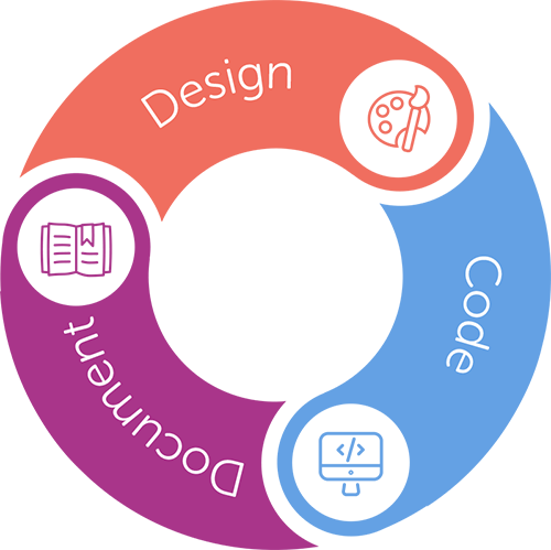
Perhaps it would help if I defined what I’m talking about a little more. A design system is really just a formal process and the documentation associated with that process. For us it came in three parts outlined below.
Design. The workflow should allow designers to update/save from sketch and make their work available to the engineers as close to instantly as possible.
Code. A more streamlined workflow that allows engineers to easily find and use components / modals /styles that they need to build features.
Documentation. All of this would be documented dynamically and viewable online for team members and 3rd parties to use and learn.
Collaboration
Converting all of our files to Sketch and creating a robust library of symbols / components was the first step. For Words With Friends it was a total of 54 screens, 600+ components, and still counting. I needed to do an audit of the existing working files and design specs to get a sense of where we were. Our files were a mess, scattered in pieces of photoshop and sketch files. It turns out I basically needed to create all of this from scratch since the files were not set up in a way to create a library. A past employee had taken a stab at creating the libraries, but they weren’t created in collaboration with engineering. If you want your Design System to be something both disciplines find useful, frequent communication between Engineering and Design is essential. Make sure to include them in setting rules for naming layers, files, and file/folder structure as well. Big shout out to Peter Turner and Himanshu Masand for their hard work, input and can-do attitude. Creating a design system is definitely a team effort and it was great working with such talented, passionate people. Find people who are equally as invested and motivated as you are to make it happen. While it was easy to get buy-in for the system, we still had a limited window of time to execute it. Some things could wait, but we needed to build the foundation as we made the transition from Native to React Native. Pete was a rock star here, he built the system in a way that was easily scalable. I’ve outlined what we accomplished in Milestone 1 below. This was all done in little more than a month’s time for the most part by Pete and I, but with constant discussion/collaboration with the other engineers and designers — some of whom I call out later.
Milestone 1
Created Sketch libraries for existing screens and features.
Decided on basic Design -> Engineering pipeline.
Sketch files are checked into git as libraries.
Created a script that gets font and color data from a Sketch file and converts them to JSON with Typescript interfaces.
Using Zeplin to for additional specs and details in the short term.
Built in a way that allows us to expand our capabilities down the road.
Here’s a peak into the main symbol library and structure of the components. For a game with over 50 screens there are 600+ so organization is key.
Our short term solution for missing data (text wrapping, responsive layout rules, etc.)
Basic Workflow
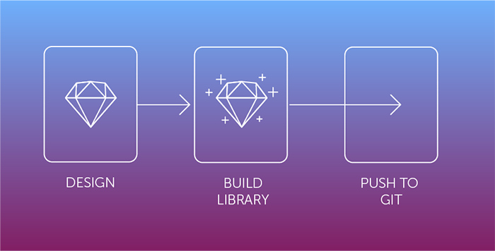
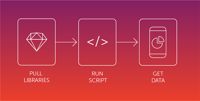
Since efficiency was an important goal we wanted to limit the amount of time designers spent preparing files / assets /specs for engineering, as well as the amount of time engineering spent implementing, and polishing UI. For both disciplines it was important to make things quicker and easier. We experimented with a lot of software — Zeplin, Fractal, Sketch, Measure, Craft, etc — but ultimately the solution we landed on was to take the data straight from Sketch itself. Zeplin is being used in the short term to document some additional specs. Here’s the designer and engineering workflow.
Design
Design as usual in Sketch.
Create library with screens and symbols from original Sketch file.
Push to git.
Engineering
Pull libraries from design repo.
Run script in code repo which generates design data and Typescript interfaces for the game to use.
Use data in game.
What’s next?
This is just the beginning for Words With Friends. We’ll continue to refine the process as we use it and as new team members join the team. We also want to increase the capabilities and eventually export more complex code such as entire React components that we can use in game. It would be cool to build some prototyping tools as well, maybe even bringing code back into sketch so that prototypes use real data. Design, Engineering and other disciplines will continue to collaborate and discuss their needs and abilities. This process should evolve to suit those needs and pursue the goals that we started with. Efficiency, quality and communication can always be improved. For the design team this system allows us to focus on the big design decisions. The ideas, strategies and experiences that our players will love, not the minor details that can be distract from what’s important.
Continue building out additional components and screens in sketch (gameboard, tile melds, etc.)
Select software to create dynamic brand guidelines from sketch.
Use more data from sketch files (margins, positioning, stretching rules, etc).
Support for override sketch files (like for theming)
Image support in the pipeline (auto copy only images used)
Exporting useable react native code from sketch.
Continued brainstorming, updates and collaborations between design and dev.
Special Thanks to the following people. I’m sorry if I missed anyone.
Peter Turner
Himanshu Masand
Neha Belwalkar
John Bacon
Brian Tse
Originally published on the Words With Friends Engineering blog


